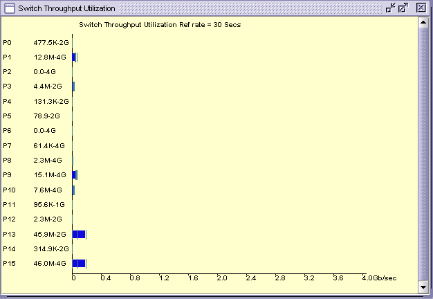
One of my pet peeves about the Brocade performance graphs is the bad legend. Take this example:

The line across the bottom is clearly labeled "Gb/sec". Following the rule of, "big B is byte, little b is bit," this should mean gigabit, not gigabyte. Port 13 is shoving data at 45.9Mb/sec speeds, and is on a 2Gb port.
This is wrong. Port 13 is a NetWare server where I'm running a TSATEST virtual backup against a locally mounted volume. The reported data-rate was 2203 MB/Minute, or 36.7 MB/Second, or 293 Mb/sec. The difference between the reported data rate of 36.7 and the Brocade rate of 45.9 probably has to do with caching, but I'm not 100% certain of that.
More generally, I've seen these charts when I've been pushing data at 140MB/Second (a RAID0 volume, I was doing a speed test) which is over 1Gb/s. As it happens, that was the first time I'd ever seen a Fibre Channel port exceed 1Gb, so it was nifty to see. But the performance reported by the Brocade performance monitor was 140 Mb/s. Clearly, that legend on the bottom is mis-labeled.
I can't figure out why that would be, though. The fastest port we have in the system are those 4Gb ports, and their max data-rate would be 512 MB/s. A speed that wouldn't even reach "1.2" on their chart. I don't get that.