Back in March I ranted about the StackOverflow Developer Survey analysis.
The core of the critique is that they had a nice trove of data useful for recruiters and didn't do anything useful with it. Their rank these aspects of a potential job opportunity from least to most important question is the big one, and their official analysis just reports most-desired/least-desired. Since pay is one of the options, pay was the most desired thing. My proposal is that the number two and three most popular things are actually quite useful, as those are what allows a company that can't compete directly on pay to get in front of people.
StackOverflow recently released the full survey data, allowing me to answer my own questions.
There is some very good data they could have presented, but chose not to. First of all, the number one, two and three priorities are the ones that people are most conscious of and may be willing to compromise one to get the other two. This should have been presented.
- All respondents top-3 ranked.
- All men top-3 ranked.
- All women top-3 ranked.
- All non-binary top-3 ranked.
Because men were 92% of all respondants, I'm not going to bother looking at that number since the men-top-3 would look nigh identical. Here is the top-3 chart for things Men look for in a job opportunity.
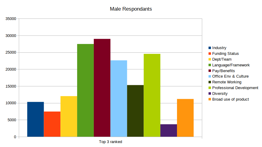
- Pay/Benefits -- Pay me what I want
- Language/Framework -- in the languages I want
- Professional development -- and help me get better at it.
With Office Environment and Culture as a close number 4. Yes, the squishy SJW-like "office culture" made a high ranking with men.
The chart for women was a bit different, which is useful if you're targeting for diversity.
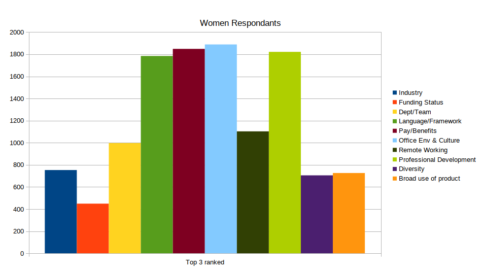
This chart shows four items at about the same prevalence in the top three:
- Office Environment and Culture
- Pay/Benefits
- Professional Development
- Framework/Language
The absolute rankings are a bit different, with Office Environment leading ahead of pay. The shape of this chart tells me that women value a healthy office environment and an employer willing to invest in their employees. Men value this as well, but not as much as they value money and what they'll be working on.
However, the StackOverflow survey had more genders than just Man/Woman. They tracked two more categories. How did the Transgender and Gender-Nonconforming/Genderqueer/Non-Binary populations compare? These are groups who typically are the diversity in their departments. How does that affect preferences when assessing a job?

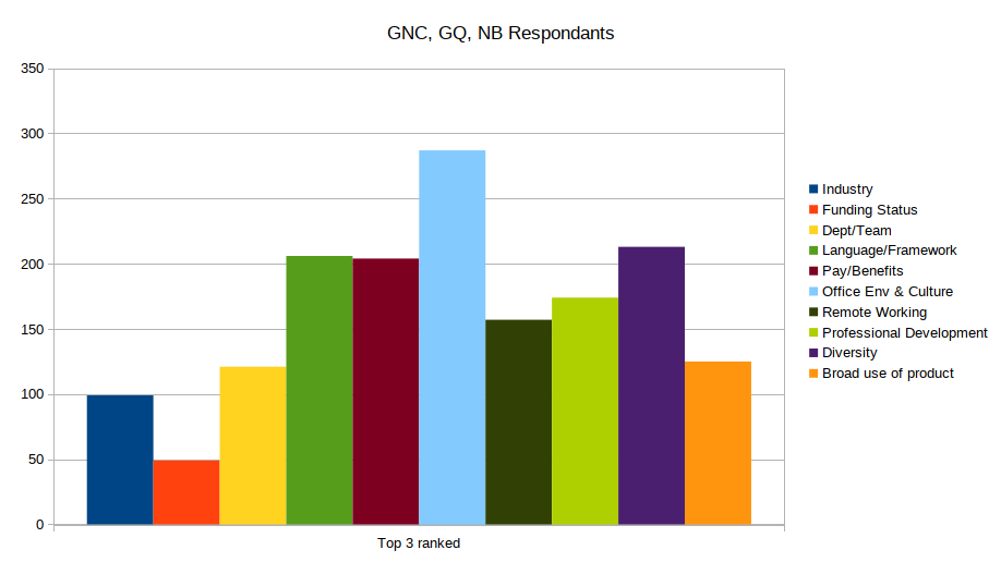
While these populations are rather smaller than the other two, a clear trend emerges. Both populations value Office Environment and Culture well above anything else. Both populations also rank Diversity very highly. The GNC/GQ/NB set values that above pay/benefits. This suggests that people in this set are willing to sacrifice pay to work someplace they'll be accepted into.

Looking at the ranked-in-top-3 charts has proven useful for recruitment, far more than simply looking at the top-ranked items.
- Men and women look for the same things: pay, tech they'll be working with, professional development, and office-environment.
- Women are more interested in professional development and office environment than men, which gives you hints about how to craft your postings to draw in more women.
- Transgender and GNC/GQ/NB applicants replace professional development with diversity in what they look for. This also gives you hints about how to craft your postings to draw more of these applicants.
- If you can't compete on pay, you can still compete on the other three points.
They also asked about assessing company benefits. That ended up a less interesting analysis as there was little variation between the genders. Here is the chart for Women.
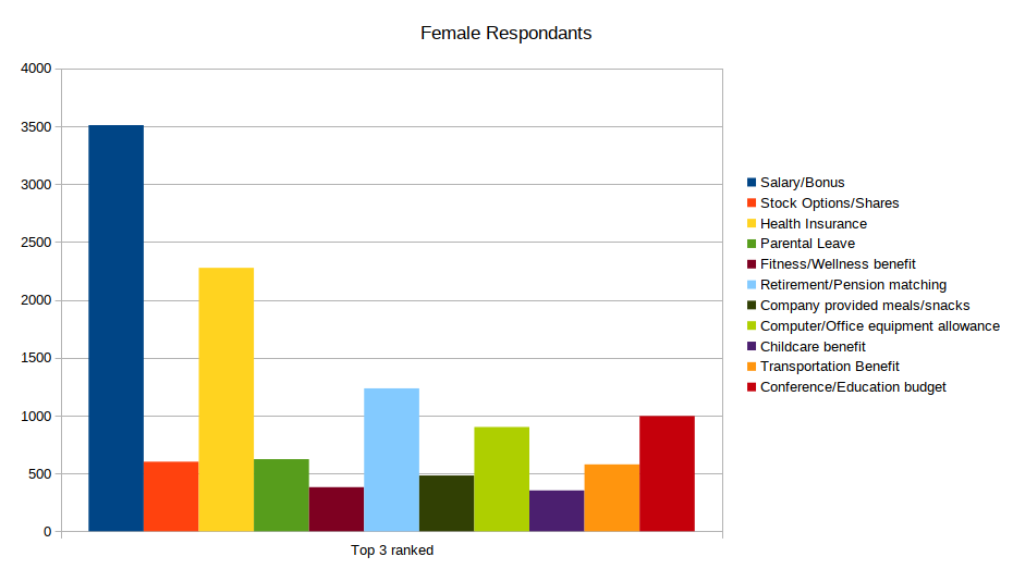
The rankings held true across all four genders, with some variation in the number 4 and 5 spot:
- Pay/Bonus
- Health insurance
- Retirement/pension matching.
- Conference/Education Budget
- Computer/Office equipment allowance.
Men had a tie between Stock Options and Computer/Office equipment allowance with Conference/Education Budget as the next-higest.
Transgender respondants preferred Computer/Office equipment allowance over Conference/Education Budget.
The GNC/GQ/NB respondants matched the women in preferences.
Even so, there are some suggestions here for recruiting departments to tailor their messaging regarding company benefits:
- Pay is king, which we all know already.
- Healthcare is second. If your company is doing anything special here, like covering employee copays/deductables, definitely mention it.
- 401k and other retirement matching is a worth-while differentiator.
- If you have a 401k/403b match, mention it in the job-posting every time.
- I need to see what the age-based rankings are for this one. I suspect that senior engineers, who are likely older, consider this one more important than juniors.
- Only men care about stock-options as a high priority benefit.
There was something else I noticed in the charts, and it was hinted at in the official report. On the 'assessing a job opportunity' question, Men famously ranked diversity as their least important benefit. It looks like there was a clear "one star review" effect at work here. This is the chart of preferences for Men on that question.

Note the curve of the 'Diversity' line. It's pretty smooth, until you get to 10 when it jumps sharply. That says a large population of respondants knew that Diversity would be their last-ranked item from the start, and the ranking didn't show up organically. The curve of the other lines suggests that 'Broad use of product' and 'Department/Team' were robbed of rankings to feed the Diversity tanking.
However, this is an extreme example of something I saw in the other genders. The Women show it pretty well.
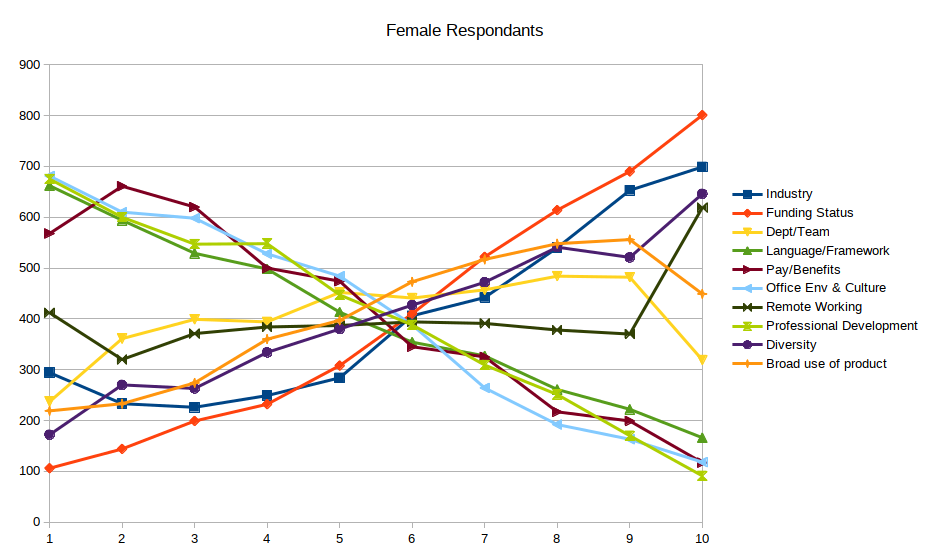
Look at the curves between 9 and 10. The items that were ranked in the top 3 have smooth curves across the chart. Yet something like Remote Working, which had an even distribution across ranks 1 through 9, suddenly jumps for rank 10. Looking at these curves, people have very clear opinions on what their top and bottom ranks are.
If you've read this far you've noticed I've pretty much ignored rankings 4 through 9. I believe these second charts show why that is; there isn't much information in them. In my opinion this is bad survey design. Having people rank a long list of things from least to most will give you a lot of wishy-washy opinions, which is not enough to build a model off of. Instead, have them pick a top-3 and maybe a bottom-2. Leave the rest alone. That will give you much clearer signals about preferences.